April 1, 2024
#2914: Eclipse Coolness explain

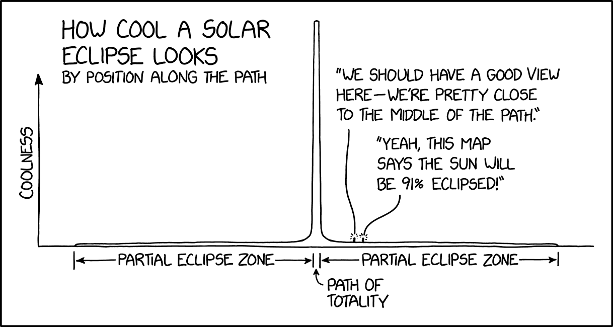
[A graph is shown with a curve starting from zero a bit from the left of the Y-axis and from there staying almost at the same height just above the X-axis from left to right, where it again goes to zero a bit from the right end of the X-axis. That is except at the very center of the graph, where the line peaks going to a point high above the top of the Y-axis. An arrow is pointing up on the top of the Y-axis and this axis has a label to the left. The X-axis has no label or arrow, but there are three segments beneath it, two large left and right of the peak and a very small in the middle just under the peak. The two large segments has a double arrow pointing from the two lines at the left and right of their segments, and in the middle of these arrow there are labels. Beneath these segments there is another label with an arrow pointing to the gap between the lines of the two long segments. At the top left of the graph there is a large header with a sub header beneath:]
How cool a solar eclipse looks
by position along the path
Y-axis: Coolness
Label beneath X-axis left : Partial eclipse zone
Label beneath X-axis center: Path of totality
Label beneath X-axis right : Partial eclipse zone
[Two small dots representing people are drawn a bit to the right of the path of totality zone. Star bursts above these indicate they are speaking with their text shown above them:]
Left person: We should have a good view here - we’re pretty close to the middle of the path.
Right person: Yeah, this map says the sun will be 91% eclipsed!