February 1, 2021
#2419: Hug Count explain

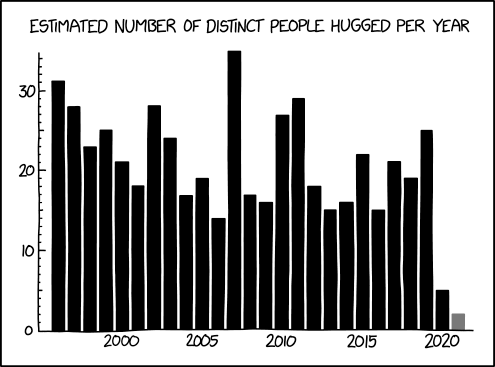
[A bar graph is shown with 25 black bars and one gray at the far right. Most of the bars have a height around the center of the graph, but the one in the middle is clearly higher than all others, and the two before and after are lower than average. There are also a couple of high bars in pairs on either side of the central spike. The far-right, however, are two very low bars, with the last in gray less than half the height of the previous, which was already only a third of the next lowest bar. There are numbers on both axes. The X-axis has the year for every fifth year below the relevant bar, and the number of hugs is given in intervals of 10 on the Y-axis. The Y-axis has ticks for every number, but those with labels are longer. The chart has a title written above:]
Estimated Number of Distinct People Hugged per Year
[Y-axis:]
30
20
10
0
[X-axis:]
2000 2005 2010 2015 2020