November 3, 2021
#2537: Painbow Award explain

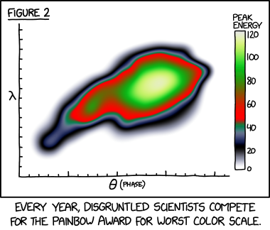
[A figure of a graph is shown, the figure has a number as if used in a paper. The graph has two labeled axis, however they have no units. The Y-Axis has 15 ticks of equal length, the X-axis has 21 ticks, with every fifth double the height of the other. The graph displays a messy shape with color gradients, with a bright spot to the right of the shape around the middle right part of the graph. This bright spot is surrounded by mainly green and red, with darker colors at the edge, and the rest of the graph white. On the right side of the graph there is a labeled bar with the color scale. To the right of this are numbers indicating what the color represents. The color scale begins at the bottom with white, then goes to gray/blue, to black, back to blue, to gray, to green, to dark red, to red which fades via brown in to green, from where it fades slowly from darker green to lighter green ending up as yellow before going back to white again at the top.]
Label: Figure 2
Y-Axis: λ
X-Axis: θ (phase)
Scale label: Peak Energy
120 (White)
100 (Green)
80 (Darker green)
60 (Red)
40 (Green)
20 (Black)
0 (White)
[Caption under the panel:]
Every year, disgruntled scientists compete for the Painbow Award for worst color scale.