May 4, 2020
#2302: 2020 Google Trends explain

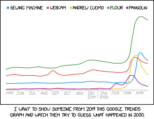
[A line chart plotting the popularity of various search terms from May 2019 through April 2020: sewing machine (blue line), webcam (red), Andrew Cuomo (yellow), flour (green), and pangolin (purple). The yellow line starts at the bottom of the chart and rises about halfway up at the end of March 2020 before decaying to about 20% by the end of April. The purple line starts at the bottom of the chart and has a small lump in February 2020 and a slightly bigger lump in March 2020 before trending back down. The blue line starts at about 10% up the chart and then spikes up to 50% at the beginning of April before decaying to 40% at the end of April. The red line starts at about 20% up the chart, has a small lump in September 2019, and then jumps up to 40% in March 2020 before trending back down. The green line starts at about 30% up the chart, has a small lump in December 2019, and then spikes up to the top of the chart at the end of March 2020.]
[Caption below comic:]
I want to show someone from 2019 this Google Trends graph and watch them try to guess what happened in 2020.