April 15, 2020
#2294: Coronavirus Charts explain

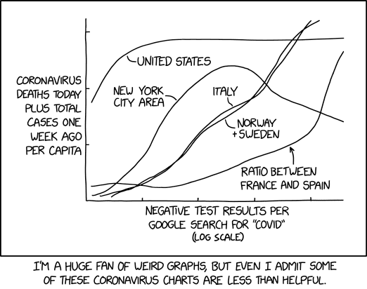
[A graph is drawn.]
[A curve labeled “United States” starts about halfway up the vertical axis, rises almost to the top, and then levels off about a third of the way along the horizontal axis.]
[4 other curves are also shown, labeled “New York City area”, “Italy”, “Norway + Sweden” and “Ratio between France and Spain”.]
Y-axis label: Coronavirus deaths today plus total cases one week ago per capita
X-axis label: Negative test results per Google search for “COVID” (log scale)
Caption: I’m a huge fan of weird graphs, but even I admit some of these coronavirus charts are less than helpful.