February 21, 2020
#2271: Grandpa Jason and Grandpa Chad explain

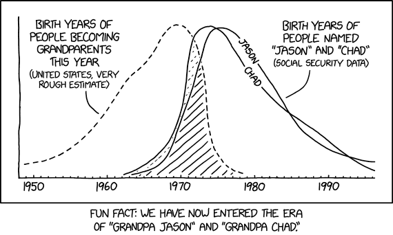
[A progression chart covering the period of years between 1950 to 1995. One line, representing the birth years of people becoming grandparents, is dotted and begins low at the start, climbs, then steeply declines. Two solid lines, representing the birth years of people named “Chad” or “Jason”, begin in the early 1960s, rise almost concurrently, however one declines steadily while the other has a curve almost before the end of the chart. The overlapping area between the dotted and solid lines is shaded. The lines show the following data:]
Birth years of people becoming grandparents this year (United States, very rough estimate)
[A dotted line which begins at 1950, rises to its peak at 1970, then steeply declines to zero by the late ’70s.]
Birth years of people named “Jason” and “Chad” (Social Security data)
[Chad: A solid line beginning at 1962, rises to its peak by 1975, then drops through the ’80s and ’90s. Jason crosses underneath it in 1985, but then re-crosses it in 1993.]
[Jason: A solid line beginning at 1963, rises to its peak between 1977-80, then declines, dropping beneath Chad around 1985 but climbing above it again in 1993.]
[Caption below the comic:]
Fun fact: We have now entered the era of “Grandpa Jason” and “Grandpa Chad.”