September 19, 2018
#2048: Curve-Fitting explain

Curve-Fitting Methods
and the messages they send
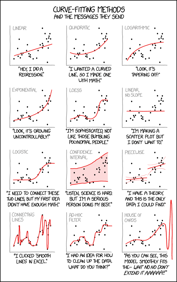
[In a single frame twelve scatter plots with unlabeled x- and y-axes are shown. Each plot consists of the same data-set of approximately thirty points located all over the plot but slightly more distributed around the diagonal. Every plot shows in red a different fitting method which is labeled on top in gray.]
[The first plot shows a line starting at the left bottom above the x-axis rising towards the points to the right.]
Linear
“Hey, I did a regression.”
[The second plot shows a curve falling slightly down and then rising up to the right.]
Quadratic
“I wanted a curved line, so I made one with math.”
[At the third plot the curve starts near the left bottom and increases more and more less to the right.]
Logarithmic
“Look, it’s tapering off!”
[The fourth plot shows a curve starting near the left bottom and increases more and more steeper towards the right.]
Exponential
“Look, it’s growing uncontrollably!”
[The fifth plot uses a fitting to match many points. It starts at the left bottom, increases, then decreases, then rapidly increasing again, and finally reaching a plateau.]
LOESS
“I’m sophisticated, not like those bumbling polynomial people.”
[The sixth plot simply shows a line above but parallel to the x-axis.]
Linear, no slope
“I’m making a scatter plot but I don’t want to.”
[At plot #7 starts at a plateau above the x-axis, then increases, and finally reaches a higher plateau.]
Logistic
“I need to connect these two lines, but my first idea didn’t have enough Math.”
[Plot #8 shows two red lines embedding most points and the area between is painted as a red shadow.]
Confidence interval
“Listen, science is hard. But I’m a serious person doing my best.”
[Plot #9 shows two not connected lines, one at the lower left half, and one higher at the right. Both have smaller curved lines in light red above and below.]
Piecewise
“I have a theory, and this is the only data I could find.”
[The plot at the left bottom shows a line connecting all points from left to right, resulting in a curve going many times up and down.]
Connecting lines
“I clicked ‘Smooth Lines’ in Excel.”
[The next to last plot shows a echelon form, connecting a few real and some imaginary points.]
Ad-Hoc filter
“I had an idea for how to clean up the data. What do you think?”
[The last plot shows a wave with increasing peak values. Finally the plot of the wave is continued beyond the x- and y-axis borders.]
House of Cards
“As you can see, this model smoothly fits the- wait no no don’t extend it AAAAAA!!”