July 23, 2018
#2023: Y-Axis explain

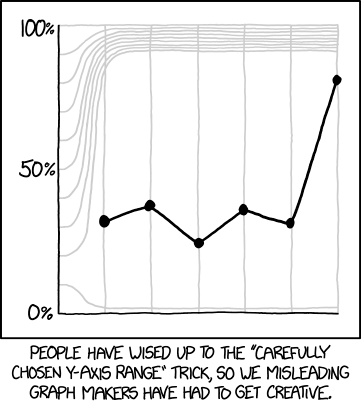
[Graph within a frame. The x-axis is unlabeled, with, in addition to the vertical line representing the y-axis, six straight vertical grid lines, evenly spaced, each corresponding to one of the six data points of the line plot. The y-axis has eleven grid lines, including the x-axis, which are evenly spaced where they intersect the y-axis. Only the lines for 0% (the x-axis), 50% (the line starting halfway up the graph), and 100% (the top of the graph) are labeled. Except for the x-axis and the top line, these “horizontal” grid lines are not straight: they start out horizontally, but by the time they have met the first vertical line, representing the first data point, they have diverged significantly from their original positions. The lines representing 20% to 90% curve upwards and then back to horizontal, so that the eight lines representing y-axis values from 20%-90% are, after the first data point, squeezed into the top 10% of the area of the graph. From this point onwards, the line representing 20% is horizontally even with the label for the 90% line, and the 30%-90% lines are evenly spaced between the 20% line and the 100% line at the top of the graph. Similarly, the 10% line curves downwards and then back to horizontal by the first data point, continuing horizontally from there at a level of approximately 2% of the total height of the graph. The data points are at approximately 30%, 35%, 20%, 33%, 30%, and 80% of the total height of the graph, and are all between the lines which begin at 10% and 20% of the height of the y-axis.]
[Caption below the frame:]
People have wised up to the “Carefully Chosen Y-Axis Range” trick, so we misleading graph makers have had to get creative.