March 14, 2018
#1967: Violin Plots explain

[Header over a violin plot type chart:]
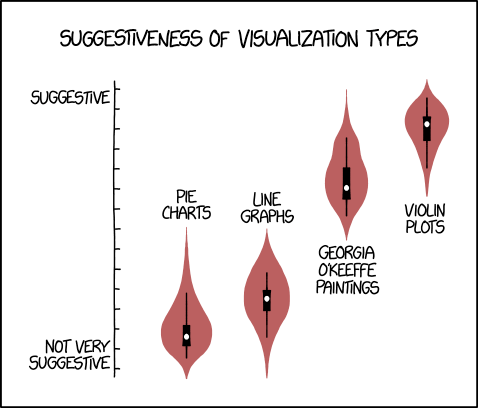
Suggestiveness of different visualization types
[The chart only has an Y-axis with tics, ranking the points on the plot. There are legends at the top and at the bottom:]
Suggestive
Not very suggestive
[There are four points on the graph, each with a mucosa colored and “violin” shaped probability density around each point. The points are white inside a black box plot like structure with black error bars. The two first points to the left are very low near the bottom of the Y-axis while the two next point to the right are almost at the top of the chart, the last also clearly with the probability density higher than the second last. Above the first two and below the second two points there are legends:]
Pie charts
Line graphs
Georgia O’Keeffe paintings
Violin plots