February 2, 2018
#1950: Chicken Pox and Name Statistics explain

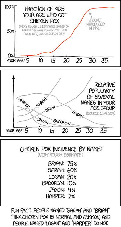
[The first panel shows graph with only the x-axis labeled and with seven labeled ticks. The y-axis has three ticks with percentage labels. A red line rises from bottom to top as it goes from left to right. There is an arrow pointing at the graph with a label. Above the left part of the red line there is a title and beneath that a reference to the source of the data in gray font.]
[According to the graph, the percentage is close to 0 for ages below 15 and close to 100 for ages above 30.]
Fraction of kids your age who got chicken pox
(Very rough US estimates based on DOI:10.15585/mmwr.mm6534a4 and DOI:10.1016/j.vaccine.2012.05.050)
100%
50%
0%
Your age: 5 10 15 20 25 30 35
Vaccine introduced in 1995
[The second panel shows a graph with only the x-axis labeled and with seven labeled ticks. The graph has six gray lines with labels on them. To the right is a title and beneath that a reference to the source of the data in gray font.]
[According to the graphs, Sarah and Brian are more popular names for older age groups.]
Relative popularity of several names in your age group
(Source: ssa.gov)
Harper
Sarah
Jaxon
Brian
Brooklyn
Logan
Your age: 5 10 15 20 25 30 35
[The third panel shows a list of names with a percentage next to them. Above the list is a title and beneath that a statement in gray font:]
Chicken pox incidence by name:
(Very rough estimate)
Brian: 75%
Sarah: 60%
Logan: 20%
Brooklyn: 10%
Jaxon: 4%
Harper: 2%
[Caption below the panels:]
Fun Fact: People named “Sarah” and “Brian” think chicken pox is normal and common, and people named “Logan” and “Harper” do not.