January 22, 2018
#1945: Scientific Paper Graph Quality explain

[Heading on top of the graph:]
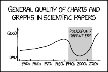
General quality of charts and graphs in scientific papers
[A graph is shown with the y-axis on the origin labeled “bad”, on the arrowhead labeled “good”, and the x-axis being a timeline labeled with decades from 1950s to 2010s.]
[The pre-1993 and post-2015 parts are white, with increasing quality before 1990 and after 2015. The 1993-2015 part indicates bad quality and is highlighted in grey, labeled “PowerPoint/MSPaint era”.]