January 10, 2018
#1940: The Food Size Cycle explain

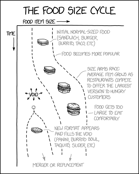
[There is a chart with the x-axis shown on top labeled “Food item size” and the y-axis labeled “Time”. There are arrows pointing away from the top left corner on both axis.]
The food size cycle
[A normal sandwich is shown high up the chart. The text on the right reads:]
Initial normal-sized food (sandwich, burger, burrito, taco, etc)
[The next part below, further in time, has no pictured item but the text reads:]
Food becomes more popular
[Next below a larger sandwich is shown.]
[And below again an even larger sandwich is shown. The text to the right is:]
Size arms race: average item grows as restaurants compete to offer the largest version to hungry customers
[On the left side, representing small food sizes, the text embedded in arrows pointing to every direction is:]
Void
[Below of that an enormously large sandwich is shown. The text is:]
Food gets too large to eat comfortably
[More below a new row on the left for small sizes comes up, inside is a panini. The text reads:]
New format appears and fills the void (panini, burrito bowl, taquito, slider, etc)
[Below of all the two paths may converge, indicated by two arrows pointing downwards and slightly together. The final text reads:]
Merger or replacement