July 19, 2017
#1865: Wifi vs Cellular explain

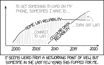
[A graph with two curves that cross each other. The two areas beneath the curve at the top, and down to either the X-axis or the other curve are shaded with vertical gray lines. The Y-axis has no label, but represents reliability, the X-axis is a timeline, with labels indicating years beneath the axis, without any ticks. The two curves are labeled with text interrupting the curves, in the second case using two lines for the text. In the left shaded area there is a label inside and the right shaded area the label is beneath the curves with an arrow pointing to the area. All this text and the arrow is gray. Above the curves there is a caption also in gray font:]
To get something to load on my phone, sometimes I have to…
Label left area: …Connect to WiFi
Label right area: …Turn off WiFi
Label curve one: Home WiFi reliability
Label curve two: Cellular data reliability
Year labels: 2000 2005 2010 2015 2020
[Caption below the panel:]
It seems weird from a networking point of view, but sometime in the last few years this flipped for me.