June 2, 2017
#1845: State Word Map explain

[Caption above the map, with sub caption:]
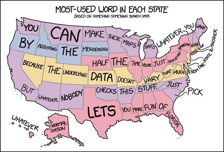
Most-Used Word in Each State
Based on Something Something Search Data
[Beneath the captions are a colorful map of the United States of America. Each state has one color, but the colors do not change from state to state, but rather between rows of states. The top “row” is purple, the second row is gray-blue, but only goes half across. Where it stops a pink row of states begins. Beneath this runs a yellow row, except it does not take California with it, since it belongs to the next purple line beneath this yellow line. Finally the two states not in the contiguous states as well as the southern states from Texas to Florida are again pink. Inside each state is written one, and only one word (or for small states the word is outside and if needed a line indicates which state it belongs to). The words size depends on the size of the state and the word. If it can fit inside the state it will be written in a font large enough to fill the entire state if possible (in one case a hyphen is used). So a short word, like “lets” in huge Texas becomes huge, but a word like “noise” which has been fitted inside small Massachusetts becomes small.]
[Here are the 50 words written in lines resembling the colors on the map (from left to right). Purple, gray-blue, pink, yellow, purple and pink:]
You can make these maps say whatever you want
by adjusting the methodology.
Half the time you’re just amplifying random noise.
Because the underlying data doesn’t vary that much from one state to another.
But whatever. Nobody checks this stuff. Just pick
whatever normal-ization lets you make fun of Florida.