December 4, 2015
#1612: Colds explain

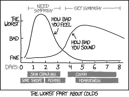
[A graph is shown with two curves. The Y-axis indicated how you feel, with three levels indicated with small ticks on the inside of the axis. These are labeled to the left of the Y–axis. The X-axis gives the time. The unit is given (days written in gray text) to the left and then the number of days are noted below the axis for each of the eight ticks on the inside of the axis. Both curves begin at the lowest level just off the Y-axis. One curve, indicating how bad you feel, rises rapidly, reaching its maximum in less than two days only to fall off almost as rapidly, ending up on an even lower level than it began with before day 5. The other curve, indicating how bad you sound, start out by staying constantly low, first rising on day 3, when the first curve are drooping down. They cross between day 3 and 4, and first then does the second curve rise, reaching its max around day 5, not as high a maximum as the first curve, but it stays up longer, falling only moderately off even after day 8, where it reaches the middle level on the Y-axis. Above the two curves are two line intervals that indicated when you need sympathy and when you get it. This text is written on the broken line. All this is in gray text. Below the X-axis are the symptoms listed for the different time period. These are written in white inside gray rectangles. The rectangles are a different length depending on how many days they last. And they are in two layers.]
[Y-axis:]
The worst
Bad
Fine
[The X-axis, with the unit written in gray just below Fine from the Y-axis:]
Days: 0 1 2 3 4 5 6 7 8
[Labels for curves:]
How bad you feel
How bad you sound
[Gray text on the two gray lines above:]
Need sympathy
Get sympathy
[Text in white on gray below, first the three to the left (one above two below), then the two to the right one above the other:]
Skin crawling
Sore throat
Aching
Cough
Hoarseness
The worst part about colds