August 20, 2014
#1410: California explain

[Caption above frame:]
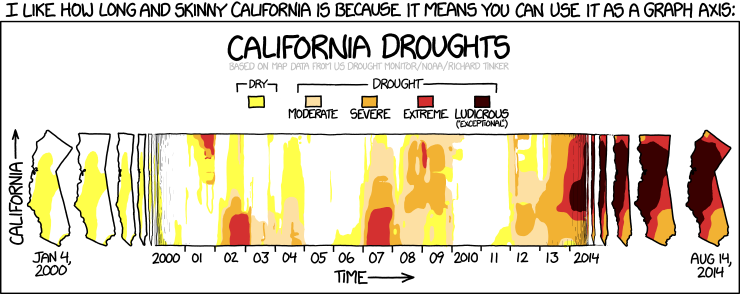
I like how long and skinny California is because it means you can use it as a graph axis:
[Title at top of frame:]
California Droughts
Based on map data from US Drought Monitor/NOAA/Richard Tinker
[A legend explains the colors which won’t show in this transcript anyway:]
Dry
[Yellow]
Drought
[Beige] Moderate
[Orange] Severe
[Red] Extreme
[Brown] Ludicrous (“exceptional”)
[A colored contour plot with Time on the X axis and California on the Y axis, and depth of drought as the dependent variable indicated by color. At the left edge, an outline of the state of California, rotated clockwise so as to be mostly vertical, with a label on the “X axis” of Jan 4, 2000, and a yellow patch indicating Dry conditions through the center of the state. To the right of that, four progressively-skinnier versions of the same image, showing more or less the same area of dryness, with the state outline shrunk along the Y axis until the fourth one is basically just a vertical line. This then merges into the main body of the graph, the true contour plot, in which the Y axis is just south-to-north distance along the state, as the X or Time axis runs from 2000 to 2014. Extreme droughts can be seen in Northern California in 2001, Southern California in 2002, and Southern California again in 2007. Moderate-to-severe drought is prevalent across most of the state in 2008-09, and then again starting in 2012, progressing to extreme and “ludicrous” in the northern 2/3 of the state by 2014. At the right-hand edge of the graph are five progressively-wider outlines of the state, reversing the pattern at the left edge, starting with a “line” and widening to a proper 2-D image of the state again, with an X-axis label of Aug 14, 2014, showing the true extent of the drought, with all areas of the state experiencing severe, extreme, or “ludicrous” levels.]