July 8, 2013
#1235: Settled explain

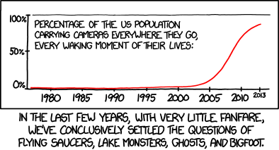
[A graph with percentage from 0 to 100 on the Y-axis with three ticks with labels, top, middle and bottom. The X-axis is a timeline with years with labeled ticks at every five years interval from 1980 but also including a final tick at the year of release, 2013, which is written in a smaller font. The graph shown a red line that starts before 1980 at just above 0% and stays there through the 80s, rises a little past 1990 and reached 1-2% at around 2000, but then it rises rapidly to 10% at 2005, 75% at 2010, and around 90% at 2013, where the rise begins to flatten out asymptotically towards 100 %. There is a caption for what the Y-axis represents over the flat part of the curve:]
Percentage of the US population carrying cameras everywhere they go, every waking moment of their lives:
Y-axis labels:
100%
50%
0%
X-axis labels: 1980 1985 1990 1995 2000 2005 2010 2013
[Caption below the panel:]
In the last few years, with very little fanfare, we’ve conclusively settled the questions of flying saucers, lake monsters, ghosts, and Bigfoot.