February 10, 2012
#1015: Kerning explain

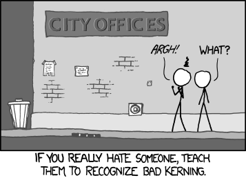
[There is a poorly-kerned sign on the side of a building. Two Cueball-like guys are standing in front of it. The first guy has his hands in fists up in front of him and a black cloud over his head.]
C I T Y O F F I C E S
First guy: Argh!
Second guy: What?
[Caption below the frame:]
If you really hate someone, teach
them to recognize bad kerning.